Behind The Scenes: User Interface Design
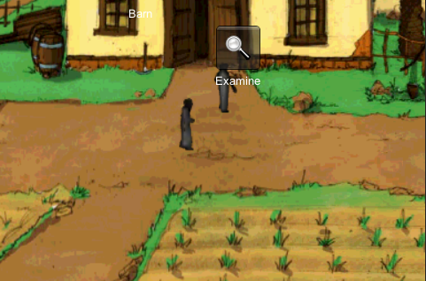
With the Christian Game Developers Conference mere weeks away, I’ve been doing some long overdue work on the user interface for Ebenezer, the Christian video game I’m developing, in the hopes of having something I can show off to people I meet there.
I’ve heard it said many times before that designing an interface for a touchscreen application is an entirely different ballgame from designing for a mouse and PC – this is the argument people like John Gruber put forward all the time for why you probably don’t want Flash applications on your iPhone as much as you think you do. But I have to say, I’d never really believed it with any conviction until I actually experienced how awful my own game was to play on an iPhone. Until recently I’ve been doing all of my testing within Unity on my laptop, using the mouse cursor to simulate a finger.
But it turns out this kind of testing can only take you so far. In particular, you just think about the fact that in real life your finger totally gets in the way! All those pretty labels I’d stuck up on the screen telling you what you were interacting with – it was all useless, because you simply couldn’t see them.

For now I’ve settled on an approach where the labels move out of the way as you drag your finger around the screen, so that hopefully you should always be more-or-less able to see what you’re pointing at. Press and hold on an item, and a selection of different ways to interact with it will pop up, or just touch briefly on an object to perform the default action.
I’m sure there’s still room for improvement, but for now it feels pretty good, and allows you to easily explore what’s in a scene.
-
Categories
-
Articles
- July 2014
- June 2014
- January 2014
- March 2013
- March 2012
- February 2012
- January 2012
- October 2011
- August 2011
- July 2011
- June 2011
- April 2011
- March 2011
- February 2011
- January 2011
- December 2010
- November 2010
- June 2010
- May 2010
- April 2010
- March 2010
- February 2010
- December 2009
- October 2009
- August 2009
- July 2009
- June 2009
- May 2009
- March 2009
- February 2009
- January 2009
- November 2008
- August 2008
- March 2008
- January 2008
- December 2007
-
Meta


